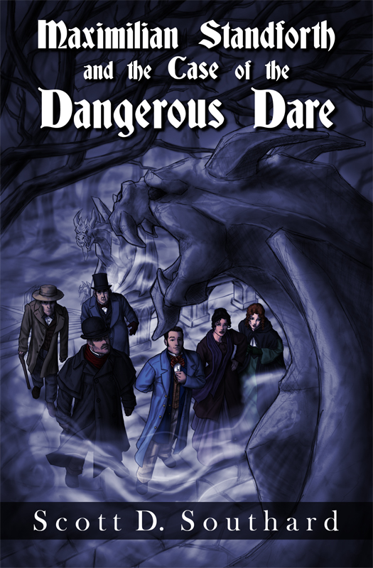
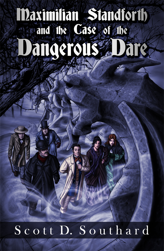
I’ve recently had the opportunity to work with author Scott D. Southard on creating a cover for his new mystery/thriller Maximilian Standforth and the Case of the Dangerous Dare and I wanted to post the cover design and share a little about my process in creating it.
Honestly, I’m not terribly good at recalling how I create my art. It tends to sort of pop into my head and I rush to get it down on paper before some new idea crowds it out. I’m a bit of a scatterbrain that way, but here goes.
After emailing back and forth a little with Scott, I was sent a short excerpt of a scene he thought would work as a setting for the cover. The writing was so vivid and the descriptions so striking that an image came immediately to my mind of his cast of characters gazing up towards McGregor castle as one of its many fearsome gargoyles loomed into frame overhead. I had several other concepts for the cover, but this one seemed to affix itself in my mind the strongest, so I went with it.
Originally I had intended to just whip up something quick. Something that would give him an idea of what I was thinking, so I would know if we were on the same page for the cover design, but the details in my head were so exact, that it didn’t seem to do justice to the idea to leave out all that richness.
Honestly, it was all I could do to restrain myself from very nearly finishing the whole thing! However, I didn’t even know if it was at all what he wanted for his book, so I focused my energy on the details that seemed to count the most. First I worked on the characters, the expressions on their faces and the design of their clothes. I wanted to capture them as best I could, so if I had got something wrong it would be instantly apparent and could be changed before the final cover was completed.
Next, I wanted to focus on the surrounding mood. The strong shadows, the mist creeping in around their feet, the harsh faces of the gargoyles as they almost seem to watch the group pass them by, and the dead and scraggly branches of the tree overhead, to add darkness to the background and help the title stand out. The cover quickly took shape, and was soon sent off for approval. Fortunately my efforts paid off and Scott loved it.
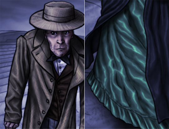
Once I started working on the final details for the approved cover, the characters were mostly ready and only really required some cleaning up, finalizing of shading, and the addition of highlights. Even though the characters will be smallish on the cover, I still took the time to try and capture certain types of materials for the different fabrics of their clothing by slight variations in shading. An example can be seen in the pictures below of the rough fabrics of Mr. Blackberry’s coat and hat, in contrast with the silken shine of Anna’s green dress.
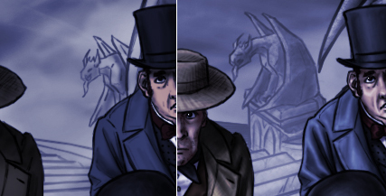
The backdrop was probably adjusted the most, slightly enlarging the gargoyle behind them to tower overhead a little more ominously, and changing the curve of the stairs to allow the distant gargoyle to become more visible. The tree overhead was completely reimagined to give it a much more complex, almost tangled web-like appearance.
The gargoyle in the foreground remained very similar in structure to the original, but his shading and highlights were almost completely redone, to capture the texture of the rough stone he was hewn from. I must admit, I somewhat relished covering him with cracks, chips and scratches to really give the impression of stone weathered over the years.
If you want to read about the author’s perspective in this process, Scott Southard has written some very good posts that can be found here, here, and here. And if you would like to know more about his book, Maximilian Standforth and the Case of the Dangerous Dare, you can find a short description here.


Beautiful! I love anything creative, I was mesmerised as I read through the process of the cover and I must confess I’m impressed! That was a great work of art.
I’m a writer too and I’ve been dabbling into graphic designs, I designed most of my book covers though I must confess, I prefer to have a picture and just splash the title on it, the chicken way to designing!! I’m glad I found your blog, hope we can be great friends!
Much love Brina! 😉
Thank you so much for your generous compliment! I’m glad you enjoyed my post. I think richly detailed custom cover art can help give a book a unique individuality, and some fiction begs for that. Still, even simple graphic layouts can be very effective. With the cover art for my own novella I could have done something very art heavy and complicated, but specifically chose to go with a clean silhouette to capture the time period and setting. I’ve seen numerous book covers with just a simple photo that were very striking. When done right, sometimes less can be more.
Thanks for taking the time to comment. You seem like a lovely and very talented woman. I wish you all the best in your worthy endeavors.
Thank you! Same here, looking forward to reading your novella!
Cheers. 🙂 🙂
Beautiful!
Your artwork is amazing! Thanks for sharing the details of what went into making this particular cover.
Thank you very much! I’m glad you enjoyed my ramblings. I typically don’t go into much detail about how I create my art, for fear it will end up being boring. 🙂
Fascinating article, Brina. I’m always interested in the creative process and how artists go about taking the writer’s intent and making a clear, concise visual to compliment the novel. You clearly captured what the author intended. It baffles me to hear from author friends with complaints that their publishers’ art department have no clue when it comes to creating covers for their books. So many are often disappointed and left to wonder if the artist/design team even read the synopsis, let alone the entire manuscript. Kudos to you!
Thank you, I’m so glad you liked it.
I know what you mean. I’ve found numerous inaccuracies in art for books and wonder at how such mistakes can get past final approval.
Sometimes I wonder how much the artists are really at fault. I’ve specifically requested information to complete past book covers, and one publisher simply didn’t bother to give it to me. Only after publication did I find out I had made an error on the cover of the book!
If hair color, eye color or any such detail is mentioned in the text, you can be sure it will be noticed if the artist gets it wrong. I always ask for more information than I could possibly need, so such mistakes can be avoided.
All the best!